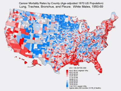
Click for larger picture |
When the global variation in cancer incidence
became evident, we wondered what was happening close to home. When analyzed
by region and state, the patterns in the U.S. were not very remarkable, but
when the rates at the county level were displayed on computer-generated
maps, patterns were uncovered that indicated enemy action and an opportunity
to learn more about environmental cancer. For lung cancer, the elevated
rates were—tended—that are shown here in red tended to cluster along the
seaboard, with the highest rates in a band of counties along the southeast
Atlantic coast. There were also some intriguing outliers with elevated rates
scattered in western areas of the country, as seen here in Montana, which
I’ll come back to. |