| front |1 |2 |3 |4 |5 |6 |7 |8 |9 |10 |11 |12 |13 |14 |15 |16 |17 |18 |19 |20 |21 |22 |23 |24 |25 |26 |27 |28 |29 |30 |31 |32 |review |
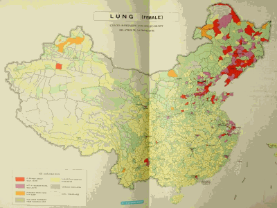 |
After our cancer maps were published, nearly every country with a system of national statistics produced maps of cancer mortality on a small-area scale. The most remarkable patterns came from China. And in the 1980s we began studies with Chinese scientists in areas with extremely high rates for various cancers. In this example, the maps for lung cancer among women revealed elevated rates clustered in the northeast, as well as in some outlying areas ... that could not be explained by smoking. |