| front |1 |2 |3 |4 |5 |6 |7 |8 |9 |10 |11 |12 |13 |14 |15 |16 |17 |18 |19 |20 |21 |22 |23 |24 |25 |26 |27 |28 |29 |30 |31 |32 |33 |34 |35 |36 |37 |review |
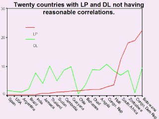 |
Both the X &
Y scales of the graph are in percent. LP is living with AIDS/population in
%, and DL is deadths/living in %. As these are ratios, a rather similar
relation might be expected for each country. but there is nothing of the
kind seen in the graph. This atrocious 2004 data has been dreamed up for the
most part, not counted and recorded. This is demonstrated in the table and
graph. Then it seems advisable to attempt analysis at the provincial not at
the national level. A few closely controlled samples are much better what is
in hand. LP & DL should list men, women, children. There might be a 10-year lag between Living and Dead counts. However, note that antiretroviral drugs will stretch this out. Besides, this data remains atrocious! Of the 20 countries in the graph, progressively, Thailand, Bahamas, Haiti and Botswana have the more erroneus PCTs. As the HIV/AIDS prevalence rises, the error accelerates. Most unfortunately indeed, conclude that if such poor nations are faced with an epidemic, they will sink. Fortunately, the prevalence is likely lower than the published PCTs by some 1.265 times. Fewer cases recorded would indicate improved sampling rather than any control of the epidemic. |