| front |1 |2 |3 |4 |5 |6 |7 |8 |9 |10 |11 |12 |13 |14 |15 |16 |17 |18 |19 |20 |21 |22 |23 |24 |25 |26 |27 |28 |29 |30 |review |
 |
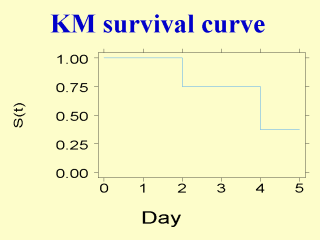
The Kaplan-Meier (KM) survival curve from the hypothetical example is plotted. It is a step function: horizontal when there is no death and drops vertically down when there is a death. If the sample size is large and the follow-up time is measured in small interval of time, the KM survival curve will look roughly smooth. Some researchers may add symbols or numbers on the figure to indicate the timing of censored observations and the number of at risk subjects. |