The Natural Sciences Undergraduate Research Conference:
Guidelines for Poster Preparation
Contents:


General aim and format

Design and layout specifications

  • The entire poster must be mounted on a 40" x 60" foam-core board. The poster does not necessarily have to fill the entire working area.
  • The board must be oriented in the "landscape" position (long dimension is horizontal).
  • A banner displaying your poster title, name, and department (or class, if appropriate) should be positioned at top-center of the board (see Figure 1).
  • Make it obvious to the viewer how to progressively view the poster. The poster generally should read from left to right, and top to bottom. Numbering the individuals panels, or connecting them with arrows is a standard "guidance system" (see Figure 1).
  • Leave some open space in the design. An open layout is less tiring to the eye and mind.
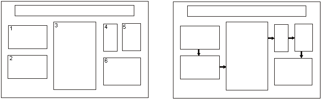
  • Figure 1: Conventional layouts for a poster. Long panel at top-center is title/author banner. Individual panels can be connected by numbers and arrows. Also, note the use of space between panels to achieve visual appeal. (from: C. W. Connor, 1992, The Poster Session: A Guide for Preparation: U. S. Geological Survey Open-File Report 88-667.)

    Lettering

  • Word-process all text (including captions). Print on plain white paper with a laser printer or inkjet printer.
  • Text should be readable from five feet away. Use a minimum font size of 18 points.
  • Lettering for the title should be large (at least 70-point font). Use all capital letters for the title.
  • Visuals

  • Present numerical data in the form of graphs, rather then tables (graphs make trends in the data much more evident). If data must be presented in table-form, KEEP IT SIMPLE.
  • Visuals should be simple and bold. Leave out or remove any unnecessary details.
  • Make sure that any visual can "stand alone" (i. e., graph axes are properly labeled, maps have north arrows and distance scales, symbols are explained, etc.).
  • Use color to enhance comprehension, not to decorate the poster. Neatly coloring black-line illustrations with color pencils is entirely acceptable.
  • Make sure that the text and the visuals are integrated. Figures should be numbered consecutively according to the order in which the are first mentioned in the text.

  • Each visual should have a brief title (for example: Figure 1- Location of study area).
    Text
  • Keep the text brief. Blocks of text should not exceed three paragraphs (viewers won't bother to read more than that). Use text to (a) introduce the study (what hypothesis was tested or what problem was investigated? why was the study worth doing?), (b) explain visuals and direct viewers attention to significant data trends and relationships portrayed in the visuals, and (c) state and explain the interpretations that follow from the data. In many cases, conclusions can be summarized in a bullet-point list.
  • Depending upon the stage or nature of your project, the text could also include sections on future research plans or questions for discussion with viewers.
  • Cite and reference any sources of information other than your own, just as you would do with a research paper. Ask your professor about the particular citation system that you should use (every discipline uses slightly different styles). The "References Cited" is placed at the end of the poster.
  • Miscellaneous Suggestions

     
    Main Page
    Registration Directions Student Registration Forms Faculty Registration Forms
    Sample Abstract Guidelines for Oral Presentations Guidelines for Poster Presentations
    Schedule 1999 Abstracts NSURG Home Page