| front |1 |2 |3 |4 |5 |6 |7 |8 |9 |10 |11 |12 |13 |14 |15 |16 |17 |18 |19 |20 |21 |22 |23 |24 |25 |review |
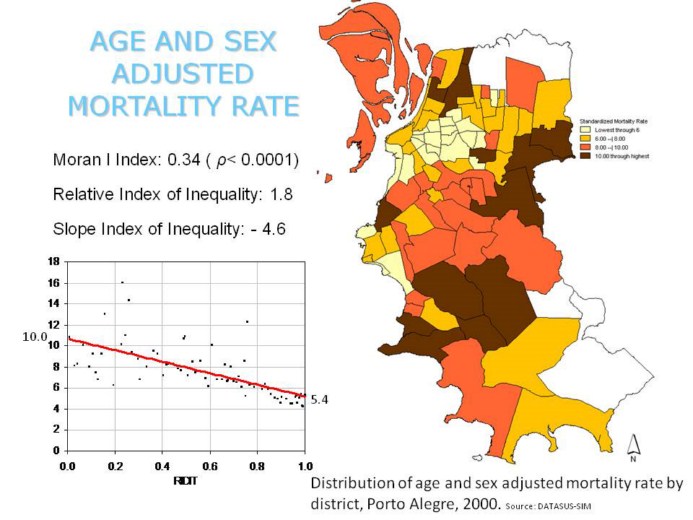 |
The total mortality rate figures are quite similar to the cardiovascular mortality rate. The same significant spatial pattern. The lower rates occurs in the districts where the rich people live.
The estimated rate of the worst district (the relative index of inequality) s almost 2 times greatter then estimated rate of the best one. |