| front |1 |2 |3 |4 |5 |6 |7 |8 |9 |10 |11 |12 |13 |14 |15 |16 |17 |18 |19 |20 |21 |22 |23 |24 |25 |review |
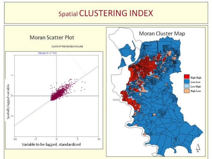 |
At the level of the census tracts, The Moran Scatter plot and the Moran Cluster map were produced. Each census tract was classified into four categories. In blue are depicted the census tracts which mean income of the head of the households was below the global mean and were surrounded by other census tracts also with income below the global mean. In red are the census tracts with high income and that are surrounded by other high income census tracts. The others are the outliers: in light blue are the low income tracts that are surrounded by high income tracts, and in pink, are the high income tracts surrounded by low income census tracts.
This quadrant represents the low-low situation. Low income census tracts (on the left in the X axe) surrounded by low income neighbours, below, in the Y axe.
As each district has some 30 census tracts, for each district we calculated the proportion of low income census tracts that are surrounded by other low income census tracts.
|