| front |1 |2 |3 |4 |5 |6 |7 |8 |9 |10 |11 |12 |13 |14 |15 |16 |17 |18 |19 |20 |21 |22 |23 |24 |25 |26 |27 |28 |29 |30 |31 |32 |33 |34 |35 |36 |37 |38 |review |
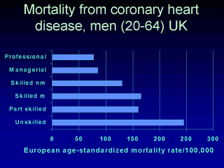 |
This chart depicts
age-standardized mortality for CHD arranged by the Registrar General of the UK’s
occupational groupings in the UK. What can you deduce from the chart? What explanations do you have for the gradations in mortality? Why should less money that your neighbour make you less healthy? It is easy to understand if you are living in poverty, but even when you are “middle class” and comfortable, this effect remains. |