| front |1 |2 |3 |4 |5 |6 |7 |8 |9 |10 |11 |12 |13 |14 |15 |16 |17 |18 |review |
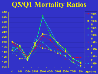 |
This slide shows
how the inter-quintile mortality rate ratios—the death rate in the poorest quintile
divided by the death rate in the richest—varied by age and sex over time. The solid lines are for males—with generally higher ratios. The dotted lines are for females—with generally lower ratios at most ages. 1971 data are shown in red, 1986 yellow, 1991 green, and 1996 blue. Ratios were highest in infancy and again during the prime working years. They were lowest at ages 15-24 and at ages 75 and over. From 1986 onwards, the ratios for non-institutionalized women aged 85 and over were considerably less than 1. |