| front |1 |2 |3 |4 |5 |6 |7 |8 |9 |10 |11 |12 |13 |14 |15 |16 |17 |18 |review |
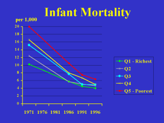 |
Now for the
results, first for infant mortality. Note that the colour-coding is the same as in the previous bar charts—with the poorest quintile in red, the richest in green, and the middle income quintile in blue. In 1971, infant mortality in the poorest quintile was 20 per thousand, or twice as high as the 10 per thousand rate in the richest quintile. By 1996, the infant mortality rate had been cut to 6.4 in the poorest quintile and to 4.0 in the richest. So the rich-poor disparity fell from almost 10 per thousand in 1971 to just 2.4 per thousand in 1996. In terms of rate ratios, however, the decline was much less impressive--from 1.97 in 1971 to 1.75 in 1996. |