| front |1 |2 |3 |4 |5 |6 |7 |8 |9 |10 |11 |12 |13 |14 |15 |16 |17 |18 |19 |20 |21 |22 |23 |24 |25 |26 |27 |28 |review |
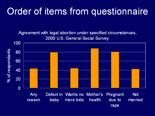 |
This chart shows the same
information as the preceding table, preserving the order of items
from the GSS questionnaire. It is much easier to observe direction
and magnitude of the response pattern from the chart than from the
table. With the table, readers must perform mental arithmetic to
figure out “Which is higher? How much higher?” In the chart, the
relative heights of bars make it easy to see that pattern.
For slides to be used in a
speech or to display a complex pattern, a chart is usually
preferable. If precise numeric values are needed, a table is the
better choice.
|