| front |1 |2 |3 |4 |5 |6 |7 |8 |9 |10 |11 |12 |13 |14 |15 |16 |17 |18 |19 |20 |21 |22 |23 |review |
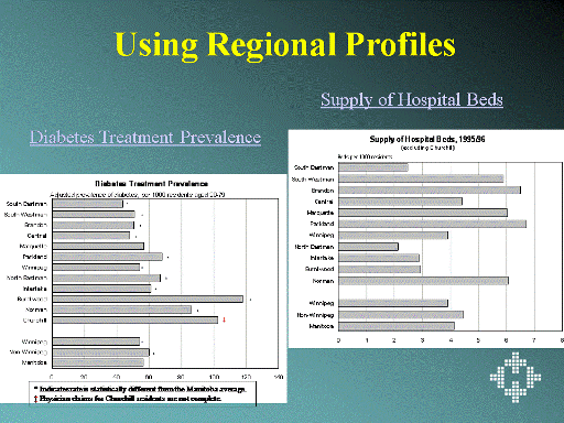 |
These two graphs illustrate how profiles for each region can help determine
whether the healthiness of a population is related to the burden of chronic
illness and the
supply of hospital beds. The regions are ordered from ‘most healthy population’ to ‘least healthy population’, as measured by their premature mortality rates. Diabetes treatment prevalence rates increase as the overall health of the regions’ populations decrease. However, hospital bed supply (one indicator of service provision) does not appear to correspond to a pattern reflecting need. Given such information, planners may consider the following: 1. Is there a relationship between the overall healthiness of the population and the corresponding health care service utilization (e.g. physician visit rates, hospital separation rates, hospital bed supply, and consult rates)? 2. If not, what could/should be changed? Also see: Winnipeg Hospital Bed Closures: Problem or Progress? (powerpoint presentation) |