| front |1 |2 |3 |4 |5 |6 |7 |8 |9 |10 |11 |12 |13 |14 |15 |16 |17 |18 |19 |20 |21 |22 |23 |24 |25 |26 |27 |28 |29 |30 |review |
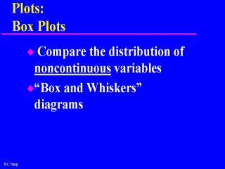 |
“Box and whiskers”
diagrams are the most well known box plots used by researchers. The “box” represent
the middle 50% or interquartile range of the data. The “whiskers” extend to the
minimum and maximum values of the data.
|