|
|
|
|
front |1 |2 |3 |4 |5 |6 |7 |8 |9 |10 |11 |12 |13 |14 |15 |16 |17 |18 |19 |20 |21 |22 |23 |review |
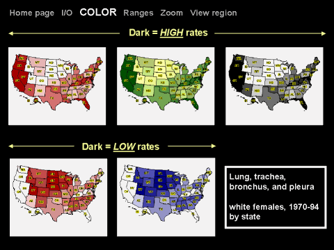 |
The user can choose from a variety of colors for the highest and lowest range of rates. The 3 maps in the first row are examples with dark colors for the high rates and light colors for low rates. The 2 examples in the second row show the opposite effect, I.e., light colors for the high rates and dark colors for the low rates. |