| front |1 |2 |3 |4 |5 |6 |7 |8 |9 |10 |11 |12 |13 |14 |15 |16 |17 |18 |19 |20 |21 |22 |23 |24 |25 |review |
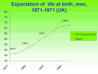 |
This graph presents the
average number of years of life that could be expected at birth for men living in the UK
for the years 1871 through to 1961. The solid line are observed data, the dotted line
represents a projection of the existing trend up to 1941 extrapolated to 1961. What do you notice about the trend? What reasons would you give to explain it? What happened around the time of the Second World War that might have lead to a flattening of the increase in expected years of life at birth? The graph appears to show that since 1871, life expectancy at birth has increased from about 41 years to about 67 years by 1970. If this represented actual gain in life expectancy, it would indicate tremendous health gain. But that is not the correct interpretation, although you will hear it said (often by people in the pharmaceutical and medical technology industries) that life expectancy has increased from 40 years to 70 years in the past 100 years thanks to modern medicine and drugs. Why is this graph misleading ? What is the correct interpretation? |