|


| |
Guidelines
for Poster Preparation
Contents:
General aim and format
-
A poster is a graphically based approach to presenting research. In presenting
your research with a poster, you should aim to use the poster as a means
for generating active discussion of the research.
-
Limit the text to about one-fourth of the poster space, and use "visuals"
(graphs, photographs, schematics, maps, etc.) to tell your "story."
Design and layout specifications
The entire poster must be mounted on a 40" x 60" foam-core board. The poster
does not necessarily have to fill the entire working area.
The board must be oriented in the "landscape" position (long dimension
is horizontal).
A banner displaying your poster title, name, and department (or class,
if appropriate) should be positioned at top-center of the board (see Figure
1).
Make it obvious to the viewer how to progressively view the poster. The
poster generally should read from left to right, and top to bottom. Numbering
the individuals panels, or connecting them with arrows is a standard "guidance
system" (see Figure 1).
Leave some open space in the design. An open layout is less tiring to the
eye and mind.
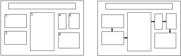
Figure 1: Conventional layouts for a poster.
Long panel at top-center is title/author banner. Individual panels can
be connected by numbers and arrows. Also, note the use of space between
panels to achieve visual appeal. (from: C. W. Connor, 1992, The
Poster Session: A Guide for Preparation: U. S. Geological Survey Open-File
Report 88-667.)
Lettering
Word-process all text (including captions). Print on plain white paper
with a laser printer or inkjet printer.
Text should be readable from five feet away. Use a minimum font
size of 18 points.
Lettering for the title should be large (at least 70-point font). Use all
capital letters for the title.
Visuals
Present numerical data in the form
of graphs, rather then tables (graphs make trends in the data much more
evident). If data must be presented in table-form, KEEP IT SIMPLE.
Visuals should be simple and bold.
Leave out or remove any unnecessary details.
Make sure that any visual can "stand
alone" (i. e., graph axes are properly labeled, maps have north arrows
and distance scales, symbols are explained, etc.).
Use color to enhance comprehension,
not to decorate the poster. Neatly coloring black-line illustrations with
color pencils is entirely acceptable.
Make sure that the text and the visuals
are integrated. Figures should be numbered consecutively according to the
order in which the are first mentioned in the text.
Each visual should have a brief
title (for example: Figure 1- Location of study area).
Text
Keep the text brief. Blocks of text
should not exceed three paragraphs (viewers won't bother to read more than
that). Use text to (a) introduce the study (what hypothesis was tested
or what problem was investigated? why was the study worth doing?), (b)
explain visuals and direct viewers attention to significant data trends
and relationships portrayed in the visuals, and (c) state and explain the
interpretations that follow from the data. In many cases, conclusions can
be summarized in a bullet-point list.
Depending upon the stage or nature
of your project, the text could also include sections on future research
plans or questions for discussion with viewers.
Cite and reference any sources of
information other than your own, just as you would do with a research paper.
Ask your professor about the particular citation system that you should
use (every discipline uses slightly different styles). The "References
Cited" is placed at the end of the poster.
Miscellaneous
Suggestions
-
SIMPLICITY IS THE KEY. Keep to the
point, and don't try to cover too many things. Present only enough data
to support your conclusions. On the other hand, make sure that you present
sufficient data to support your conclusions.
-
When you begin to make your poster,
first create a list of the visuals that you would use if you were describing
your project with only the visuals. Write the text after you
have created the list of visuals.
-
Mat the components of the poster
on separate pieces of colored poster board. This sets-off the text and
illustrations from the white mounting board. Also, you can easily attach
each component to the mounting board with push-pins or thumb-tacks.
-
Before the poster session, rehearse
a brief summary of your project. Many viewers will be in a hurry and will
want a quick "guided tour" of your poster. Don't be afraid to point out
uncertainties in your work; this is where you may get useful feedback.
|